Inspiration…
Inspiration…

More Posts from Ziggetai and Others
Inspiration.

Kawase Hasui (1883 – 1957) Snow at Shiba Gate (1936)
Inspiration.

Hiroaki Takahashi, better known by his artist name Shotei, was a leading figure in the 20th-century Shin Hanga or “new prints” style.Part 1 of 4

Glyph 999 is one of the most potent tools a Mahjuti practitioner can acquire. In essence a Glyph is a hack into the metaphorical operating system of the Reality Mesh. The technology behind the creation and use of glyphs is too extensive to explain here. In simple terms, however, it requires that the Mahjee who constructs or wields the glyph must be meticulous in its creation. The slightest error can generate unintended ripples of cause and effect that may return to the Mahjee in unexpected and sometimes disastrous ways.
This piece is available for collection now as an NFT on Hic et nunc - https://hicetnunc.art/objkt/565160


I’ve been busy. A couple of my novels have been taking up all my time, so Veil of the Gods has had to go on the back-burner for a while. I’m still working away on this project and it’s got me hooked. And I can’t wait to share the next chapter with you all.

It's been a challenging year on so many levels. I'm still putting my visual novel, Veil of the Gods, together and it's coming along very nicely.This piece is called "Morden Flin and the Glyph". Morden is a minor player in a renowned criminal gang, until he stumbles on a secret. It's a secret that someone with his limited understanding of consequences probably should have steered clear of.
Loving this style right now.

Conduit.
Twitter / Instagram / Gumroad / Patreon
KnownOrigin / SuperRare / OBJKT / Zedge
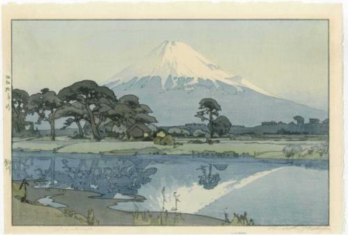
Hiroshi Yoshida 吉田 博 (1876 - 1950) - Fujiyama from Suzukawa 1928
Inspiration.

Honmon-ji Temple in Ikegami, Hasui Kawase, 1931

The process of creating a huge graphic novel like Veil of the Gods hasn’t just involved writing the story, sculpting the characters and preparing the digital artworks. I’ve also been creating typefaces. This was a hobby of mine 20 years or so ago. In 1996 I designed the font for my little book- The Moon on the Lake- published by Random House. Then I typeset the whole book with it. I mention this because it’s such a pleasure to have an excuse to build new typefaces. The graphic novel is full of them. Indeed these various typefaces are integral to the story… Here’s the proof page for two I finished today. They’re inspired by Tibetan scripts.
-
 ziggetai reblogged this · 2 years ago
 -
ziggetai liked this · 2 years ago
-
 disziplin liked this · 3 years ago
 -
 richboyz19 liked this · 3 years ago
 -
 jocandrs liked this · 3 years ago
 -
 sushidude321 liked this · 3 years ago
 -
 charles-a-turner liked this · 3 years ago
 -
 henricin liked this · 3 years ago
 -
 wizardwinterwolf liked this · 3 years ago
 -
 goldiloxparadox liked this · 3 years ago
 -
 sail0rfly liked this · 3 years ago
 -
 tamerperez liked this · 3 years ago
 -
 keikurono931 liked this · 3 years ago
 -
 randomov liked this · 3 years ago
 -
 r-ashi-d liked this · 3 years ago
 -
 ra1nd0g liked this · 3 years ago
 -
 thenewromancer reblogged this · 3 years ago
